Having had an 8 month rest from blogging – at least about bikes – I’ve made a New Year’s resolution to write at least one cycling post per week. Like most such resolutions, it may well fail – but here goes with the first one!
It won’t be a surprise to anyone whose worked on bikes for a while that nail varnish is great for retouching small paint chips on frames and forks. It’s often better than paint because it will go straight onto bare metal (or carbon fibre) and stick, it’s cheap, comes with its own brush and, perhaps most important, is very readily available in a dazzling array of colours – many more than you’ll find in standard paint ranges. The only downside is having to carry your bike around with you until you find the colour that you want. Here’s an easier way to find a match.
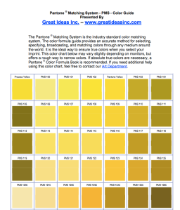
The Pantone colour chart is primarily intended for use by graphic designers and printers. You can buy one at great expense, or simply download this 18-page version. When you’ve done that, sit your bike next to your computer and print out the page containing the colour that most closely matches your frame. I like to print onto glossy photo paper because the paint on my bikes tends to be shiny, but it’s not critical. In fact, if the printer doesn’t print in accurate Pantone colours it doesn’t really matter. That’s because we’re going to be using comparative rather than absolute colour references.
Hold your freshly-printed colour chart up to the frame, ideally in daylight so that you can see the nearest match accurately. Mark the nearest Pantone colour then take your chart to the nail varnish shop and repeat the exercise – matching the nail varnish to the colour marked on the chart. If you can’t achieve an exact match, I find it’s generally better to err on the slight darker side for the nail varnish.

Excellent tip. The variables not mentioned are (1) what you see on your PC monitor won’t match what you see in real life, and (2) what your printer produces — on any kind of paper — won’t match either what the PC monitor shows OR your frame in real life. It’s a tricky problem and YMMV.
LikeLike
You’re right of course, and printed colours rarely match the screen very well. However, I find there’s normally a very close match on one of the printed swatches and from there on we’re just using it as a comparative colour, not an absolute reference. I was amazed at the number of colours you can find in nail varnish…not something I’ve used much in the past 🙂
LikeLike
Oh no, no Pantone chart for me.
I really love hauling a bicycle frame into a glitzy make up shop and shocking the super non mechanically minded and highly polished girls there by asking them to hold it while I compare shades and hues. Some find it funny, actually, some less so, suggesting I hold the frame while they handle the nail polish.
And then, at home, of course the time consuming task of filling in the chips begins – paint layer height, and what not.
LikeLike